

Caracter cu Caracter
WHAT I DID
Creative Drection
Visual Identity
Illustration
Communication
& Content
YEAR
2024
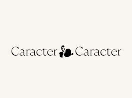
In a world where digital dominance has distanced us from the tactile beauty of letters, Caracter stands as a rallying cry for reconnection. This brand is born to remind us of the artistry, history, and humanity in the written word.
Caracter isn’t just about letters – it’s about what they represent: craftsmanship, expression, and timelessness. It invites people to slow down, to engage, and to rediscover the joy of writing through a universe that celebrates typography and the tools of its creation.


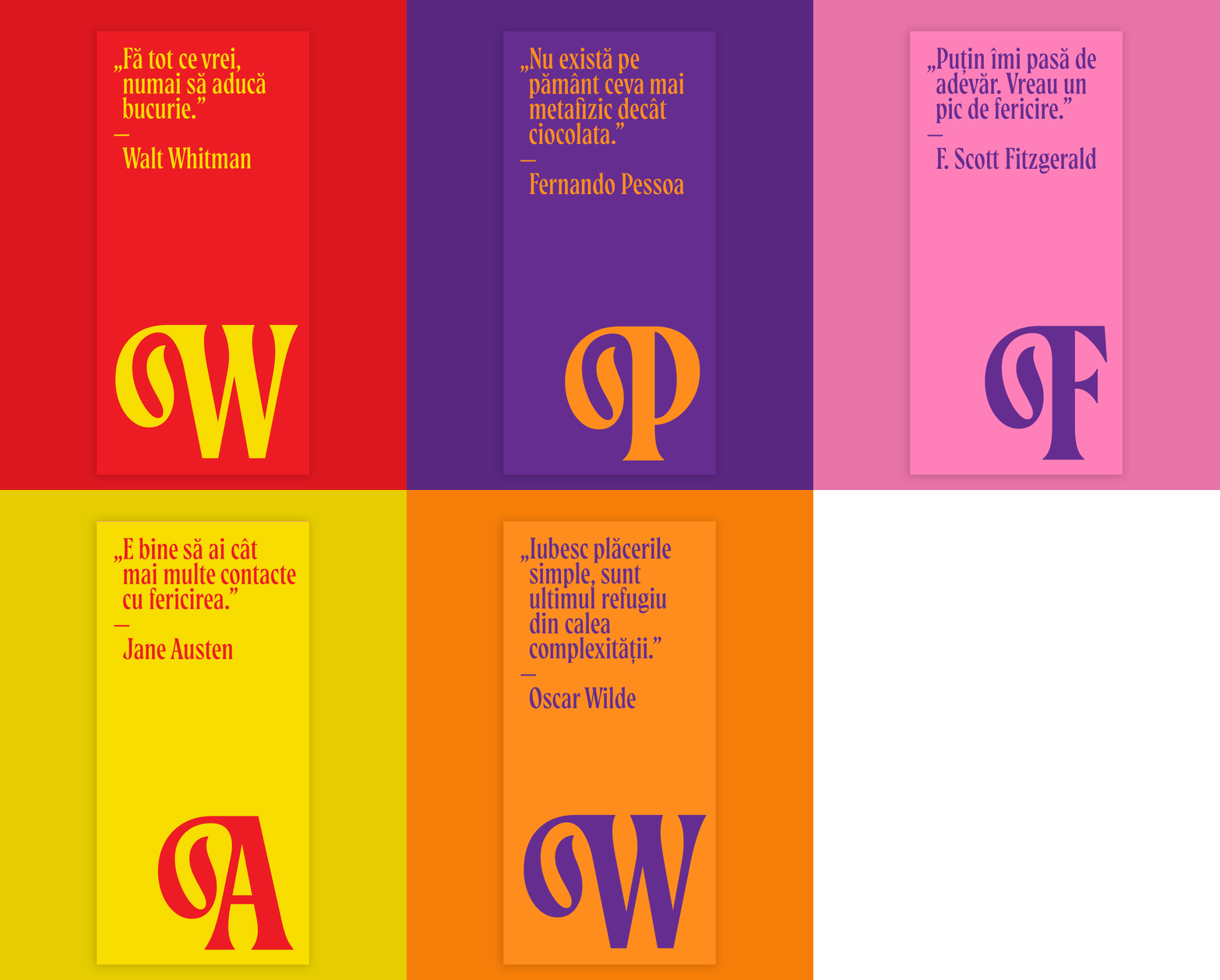
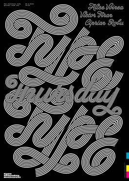
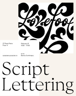
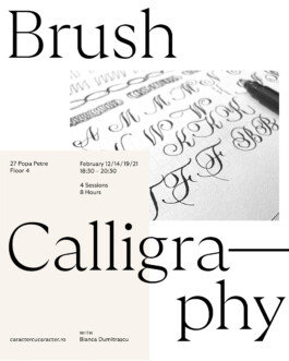
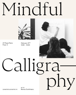
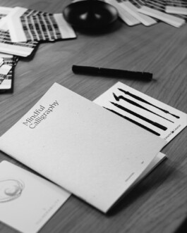
To capture Caracter’s essence, I built a visual identity that strips away distractions and brings the focus back to where it belongs—the beauty of letters and the tools that shape them.
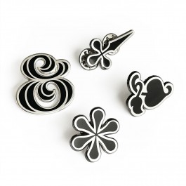
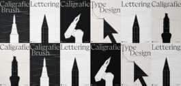
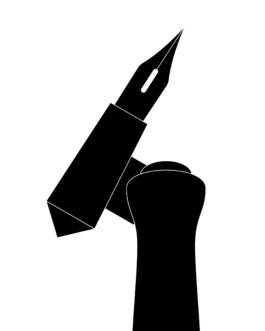
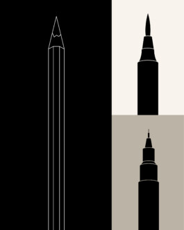
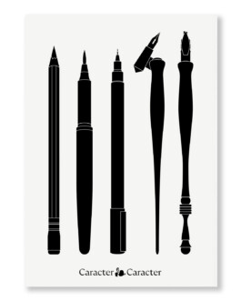
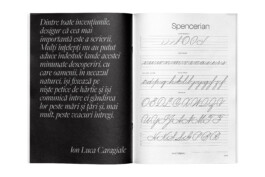
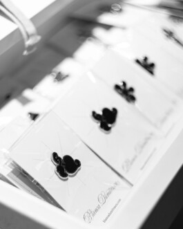
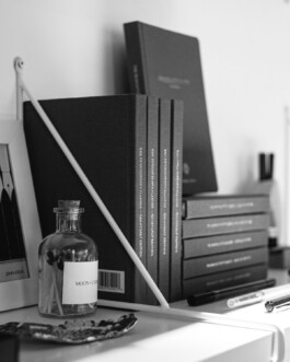
A stark black-and-white palette grounds the brand in clarity. A typeface with calligraphic roots balances technical precision with artistic flow. Clean, minimal illustrations of writing tools complete the system—refined, approachable, and timeless.
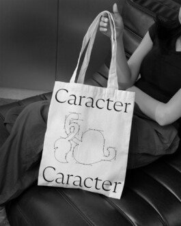
Caracter cu Caracte it’s a reminder that writing is more than a function – it’s an art form. Through a bold, minimal identity and thoughtfully crafted products, it’s inspiring a new appreciation for the written word.
This is about reconnecting with typography—it’s about rediscovering the beauty of putting pen to paper and leaving your mark.


PHOTOGRAPHY
Răzvan Sălășan
@razvanozz
Valentin Razvan
@razvanfotograf
TYPEFACE
GT Ultra
WEBSITE DESIGN
Silkeight

Caracter cu Caracter
WHAT I DID
Creative Drection
Visual Identity
Illustration
Communication
& Content
YEAR
2024

In a world where digital dominance has distanced us from the tactile beauty of letters, Caracter stands as a rallying cry for reconnection. This brand is born to remind us of the artistry, history, and humanity in the written word.
Caracter isn’t just about letters – it’s about what they represent: craftsmanship, expression, and timelessness. It invites people to slow down, to engage, and to rediscover the joy of writing through a universe that celebrates typography and the tools of its creation.


To capture Caracter’s essence, I built a visual identity that strips away distractions and brings the focus back to where it belongs—the beauty of letters and the tools that shape them.
A stark black-and-white palette grounds the brand in clarity. A typeface with calligraphic roots balances technical precision with artistic flow. Clean, minimal illustrations of writing tools complete the system—refined, approachable, and timeless.


Caracter cu Caracte it’s a reminder that writing is more than a function – it’s an art form. Through a bold, minimal identity and thoughtfully crafted products, it’s inspiring a new appreciation for the written word.
This is about reconnecting with typography—it’s about rediscovering the beauty of putting pen to paper and leaving your mark.


PHOTOGRAPHY
Răzvan Sălășan
@razvanozz
Valentin Razvan
@razvanfotograf
TYPEFACE
GT Ultra
WEBSITE DESIGN
Silkeight

type@biancadumitrascu.com

© Bianca Dumitrașcu 2025