
STUDIO6
WHAT I DID
Creative Direction
Visual Identity
YEAR
2025
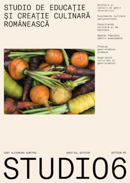
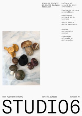
A culinary space founded by Chef Alexandru Dumitru, dedicated to gastronomy enthusiasts of all levels. It offers interactive cooking workshops, private events, and culinary consultancy, all rooted in a philosophy that values local, seasonal ingredients and sustainable practices.
The studio serves as a hub for culinary exploration, where both amateurs and professionals can develop their skills, discover the secrets of Romanian cuisine, and engage in meaningful gastronomic experiences.


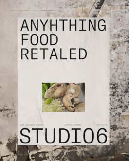
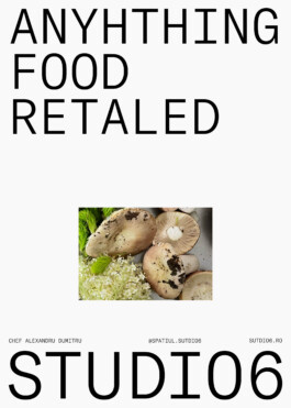
The intention was to build a visual identity that reflects Studio6’s core values—clarity, honesty, and creativity. The tone had to be minimal and contemporary, yet intimate.
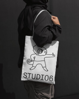
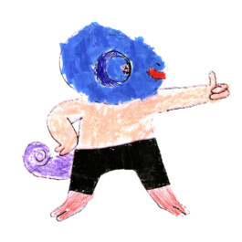
One of the most meaningful elements came from the studio’s own family: a hand-drawn character by Vladimir, Alex’s young son. The illustration was woven into the brand as a subtle, personal signature—an emblem of play, warmth, and generational creativity.
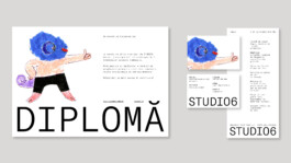
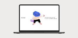
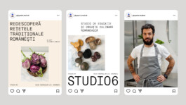
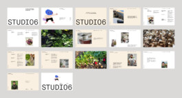
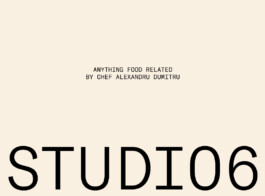
The visual identity is anchored in a monospaced typeface that brings structure, neutrality, and quiet elegance. Paired with a neutral palette, it reflects the studio’s architectural simplicity and refined culinary approach.
Vladimir’s drawing was integrated into the system as a recurring brand element, softening the clean aesthetic with a human, heartfelt layer.


STUDIO6
WHAT I DID
Creative Direction
Visual Identity
YEAR
2025


A culinary space founded by Chef Alexandru Dumitru, dedicated to gastronomy enthusiasts of all levels. It offers interactive cooking workshops, private events, and culinary consultancy, all rooted in a philosophy that values local, seasonal ingredients and sustainable practices.
The studio serves as a hub for culinary exploration, where both amateurs and professionals can develop their skills, discover the secrets of Romanian cuisine, and engage in meaningful gastronomic experiences.


The intention was to build a visual identity that reflects Studio6’s core values—clarity, honesty, and creativity. The tone had to be minimal and contemporary, yet intimate.
One of the most meaningful elements came from the studio’s own family: a hand-drawn character by Vladimir, Alex’s young son. The illustration was woven into the brand as a subtle, personal signature—an emblem of play, warmth, and generational creativity.
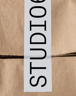

The visual identity is anchored in a monospaced typeface that brings structure, neutrality, and quiet elegance. Paired with a neutral palette, it reflects the studio’s architectural simplicity and refined culinary approach.
Vladimir’s drawing was integrated into the system as a recurring brand element, softening the clean aesthetic with a human, heartfelt layer.


type@biancadumitrascu.com

© Bianca Dumitrașcu 2025